UI toolkit
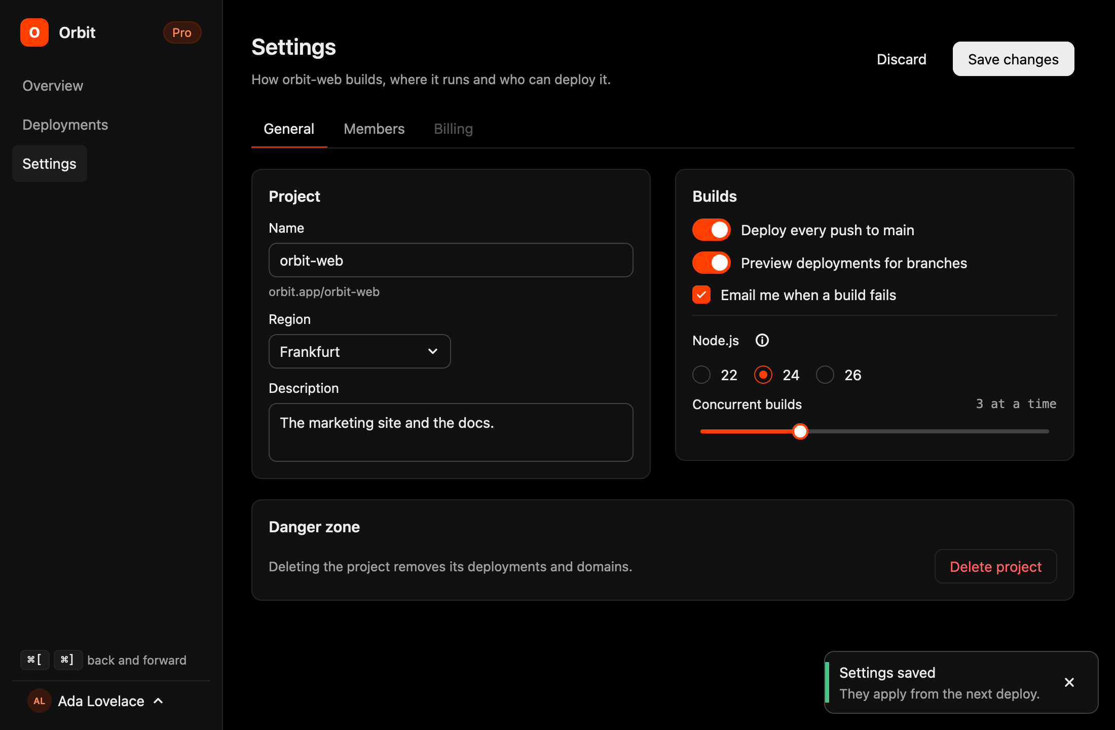
gpuix-svelte-ui is a set of components written once for both renderers: a native window through
gpuix-svelte, and a browser DOM through Vite or SvelteKit. Buttons, fields, choices, menus, dialogs,
toasts, a few layout and feedback pieces, a router for the screens of an app, and the theme behind
them. The window above is examples/ui-app, a small app built
from most of them (npm run demo:ui-app in the repository). Every component has a section of its
own below, with a sample that runs live on this page, in the DOM. npm run demo:ui opens the
showcase, every component on one screen, in a GPUI window, and npm run demo:ui-dom serves it as a
page.
Setup
npm install gpuix-svelte gpuix-svelte-ui
<script>
  import { Button, Card, apply_theme } from 'gpuix-svelte-ui';

  $effect(() => apply_theme('dark'));
</script>

<Card title="Hello">
  <Button variant="primary" onclick={() => console.log('clicked')}>Click me</Button>
</Card>
Every component reads its colours from --ui-* tokens, and apply_theme() puts a palette in force
on either renderer: through set_css_vars on GPUI, as custom properties on :root in a browser.
Call it from an $effect at the root, before anything paints, so no token is missing on the first
frame. The components themselves resolve through the package's own exports, so
gpuix-svelte-ui/components/Button.svelte is the same file as Button from the barrel.
In a GPUI app nothing else is needed. A page wants a stylesheet with what a window gives for
free: * { box-sizing: border-box }, a font, input, textarea { font: inherit } so the fields
take it too, and body { margin: 0 } (render() sets the last one; see
packages/ui/showcase/index.html). A prerendered SvelteKit
page can carry the palette before any effect runs:
<script>
  import { DARK, theme_rule } from 'gpuix-svelte-ui';
</script>

<svelte:head>
  {@html `<style>${theme_rule(DARK)}</style>`}
</svelte:head>
The components are typed as GPUI markup, so an app that ships to both targets typechecks them
with the GPUI project's tsconfig, as DOM explains;
svelte-check on a SvelteKit side types them as DOM markup, which they pass too.
Theme
apply_theme(palette) takes 'dark', 'light' or a Palette of your own. DARK and LIGHT
are the two it ships, and theme.palette is the one in force, reactive, for the odd place that
needs a value in JavaScript (TextField hands GPUI's input a theme object rather than CSS).
| Token | What it colours |
|---|---|
bg, panel, raised, raised-hover |
the window, cards and dialogs, badges and hovered rows |
border, border-strong |
hairlines and control outlines |
ink, muted |
text |
accent, accent-ink, accent-wash, on-accent |
the brand colour, its legible text, a translucent wash, text on it |
success, warning, danger, each with a -wash |
tones for badges, toasts and progress |
Each is a --ui-<token> custom property, so your own markup can read var(--ui-accent) next to
the components, and theme_vars(palette) is the full map should you want to set them yourself.
The same call sets the tokens gpuix-svelte's own Tooltip, Popover and Scroller read.
The button below switches the palette, and since the tokens are global, every sample on this page follows it.
<script>
  import { Button, Badge, apply_theme, theme } from 'gpuix-svelte-ui';

  let dark = $state(true);
  $effect(() => apply_theme(dark ? 'dark' : 'light'));
</script>

<div class="row">
  <Button onclick={() => (dark = !dark)}>{dark ? 'Light' : 'Dark'} theme</Button>
  <Badge tone="accent">{theme.palette.appearance}</Badge>
  <div class="note">accent is {theme.palette.accent}</div>
</div>

<style>
  .row { display: flex; flex-wrap: wrap; align-items: center; gap: 10px; }
  .note { font-size: 13px; color: var(--ui-muted); }
</style>
Buttons, badges and keys
Button
Button is a focusable box: Enter and Space press it, variant is default, primary, ghost
or danger, size is md or sm, and disabled takes it out of the tab order. label names a
button whose content is an icon. It spreads onmouseenter / onmouseleave, which is what lets a
Tooltip wrap it, and onfocus / onblur, so a tip given {...focus} too shows on keyboard
focus.
<script>
  import { Button, Icon, Tooltip } from 'gpuix-svelte-ui';

  let count = $state(0);
</script>

<div class="row">
  <Button>Default</Button>
  <Button variant="primary">Primary</Button>
  <Button variant="ghost">Ghost</Button>
  <Button variant="danger">Danger</Button>
  <Button disabled>Disabled</Button>
</div>
<div class="row">
  <Button size="sm" onclick={() => count++}>Count {count}</Button>
  <Button size="sm" label="Search"><Icon name="search" size={14} /></Button>
  <Tooltip content="A tooltip on a button" side="bottom">
    {#snippet children(hover, focus)}
      <Button {...hover} {...focus} size="sm">Hover me</Button>
    {/snippet}
  </Tooltip>
</div>

<style>
  .row { display: flex; flex-wrap: wrap; align-items: center; gap: 8px; margin-bottom: 10px; }
</style>
Badge
Badge is a short label in a pill, coloured by its tone: neutral (the default), accent,
success, warning or danger, the same tones Progress and the toasts take.
<script>
  import { Badge } from 'gpuix-svelte-ui';
</script>

<div class="row">
  <Badge>neutral</Badge>
  <Badge tone="accent">accent</Badge>
  <Badge tone="success">success</Badge>
  <Badge tone="warning">warning</Badge>
  <Badge tone="danger">danger</Badge>
</div>

<style>
  .row { display: flex; flex-wrap: wrap; align-items: center; gap: 8px; }
</style>
Kbd
Kbd draws its content as a key cap, for a shortcut written into a sentence.
<script>
  import { Kbd } from 'gpuix-svelte-ui';
</script>

<div class="row">
  <Kbd>⌘K</Kbd>
  <div class="note">opens the palette,</div>
  <Kbd>Esc</Kbd>
  <div class="note">closes it and</div>
  <Kbd>Tab</Kbd>
  <div class="note">walks the controls.</div>
</div>

<style>
  .row { display: flex; flex-wrap: wrap; align-items: center; gap: 6px; }
  .note { font-size: 13px; color: var(--ui-muted); }
</style>
Icon
Icon draws one of the toolkit's glyphs by name, or any SVG markup through source, size
pixels square in the colour of the text around it. ICONS holds the glyphs by name, as markup.
<script>
  import { ICONS, Icon } from 'gpuix-svelte-ui';

  const STAR = '<svg xmlns="http://www.w3.org/2000/svg" viewBox="0 0 24 24" fill="none" stroke="currentColor" stroke-width="2" stroke-linejoin="round"><path d="M12 3l2.7 5.6 6.1.9-4.4 4.3 1 6.1L12 17l-5.4 2.9 1-6.1-4.4-4.3 6.1-.9z"/></svg>';
</script>

<div class="row">
  {#each Object.keys(ICONS) as name}
    <div class="cell">
      <Icon {name} size={20} />
      <div class="name">{name}</div>
    </div>
  {/each}
</div>
<div class="row">
  <div class="accent"><Icon source={STAR} size={28} /></div>
  <div class="name">source, in the accent colour around it</div>
</div>

<style>
  .row { display: flex; flex-wrap: wrap; align-items: center; gap: 12px; margin-bottom: 14px; }
  .cell { display: flex; flex-direction: column; align-items: center; gap: 6px; min-width: 88px; }
  .name { font-size: 12px; color: var(--ui-muted); }
  .accent { display: flex; color: var(--ui-accent); }
</style>
Cards, layout and feedback
Card
Card holds a title, a description, an actions snippet at the right of the title, the body
and a footer snippet; pad and gap space it out.
<script>
  import { Badge, Button, Card } from 'gpuix-svelte-ui';
</script>

<Card title="Export" description="Three files, about a minute.">
  {#snippet actions()}
    <Badge tone="success">ready</Badge>
  {/snippet}
  <div class="note">The body is whatever the card wraps.</div>
  {#snippet footer()}
    <Button size="sm">Cancel</Button>
    <Button size="sm" variant="primary">Start</Button>
  {/snippet}
</Card>

<style>
  .note { font-size: 13px; color: var(--ui-muted); }
</style>
Stack
Stack is a flex box with its spacing as props (direction, gap, align, justify, wrap,
pad, grow), in the names both renderers know (start and end, not flex-start).
<script>
  import { Stack } from 'gpuix-svelte-ui';
</script>

<Stack gap={10}>
  <Stack direction="row" gap={8}>
    <div class="box">one</div>
    <div class="box">two</div>
    <div class="box">three</div>
  </Stack>
  <Stack direction="row" justify="space-between">
    <div class="box">start</div>
    <div class="box">end</div>
  </Stack>
  <Stack direction="row" gap={8}>
    <div class="box">fixed</div>
    <Stack grow={1}><div class="box">grows</div></Stack>
  </Stack>
</Stack>

<style>
  .box { padding: 8px 12px; border-radius: 6px; background-color: var(--ui-raised); font-size: 13px; }
</style>
Separator
Separator is a hairline across, or between the items of a row with direction="vertical", and
an optional label sits in the middle of it.
<script>
  import { Separator } from 'gpuix-svelte-ui';
</script>

<div class="column">
  <div class="note">Sign in with a passkey</div>
  <Separator label="or" />
  <div class="note">Sign in with a password</div>
  <Separator />
  <div class="row">
    <div class="note">Help</div>
    <Separator direction="vertical" />
    <div class="note">Privacy</div>
    <Separator direction="vertical" />
    <div class="note">Terms</div>
  </div>
</div>

<style>
  .column { display: flex; flex-direction: column; gap: 12px; }
  .row { display: flex; gap: 12px; }
  .note { font-size: 13px; color: var(--ui-muted); }
</style>
Progress
Progress draws value out of max (100 by default) in a tone, with an optional label and,
with show_value, the percentage beside it; size is md or sm.
<script>
  import { Button, Progress } from 'gpuix-svelte-ui';

  let upload = $state(35);
</script>

<div class="column">
  <Progress value={upload} label="Upload" show_value />
  <Progress value={92} tone="danger" label="Disk" show_value size="sm" />
  <Progress value={3} max={4} tone="success" size="sm" />
  <div class="row">
    <Button size="sm" onclick={() => (upload = upload >= 100 ? 0 : Math.min(100, upload + 20))}>Advance</Button>
  </div>
</div>

<style>
  .column { display: flex; flex-direction: column; gap: 14px; }
  .row { display: flex; }
</style>
Spinner
Spinner turns while something loads, size pixels across; label is what a screen reader
announces (Loading by default).
<script>
  import { Spinner } from 'gpuix-svelte-ui';
</script>

<div class="row">
  <Spinner size={16} />
  <Spinner />
  <Spinner size={28} label="Fetching files" />
  <div class="note">Fetching three files…</div>
</div>

<style>
  .row { display: flex; align-items: center; gap: 14px; }
  .note { font-size: 13px; color: var(--ui-muted); }
</style>
Skeleton
Skeleton is a pulsing placeholder for content still loading: width in pixels or as CSS text
such as 60%, height and radius.
<script>
  import { Avatar, Button, Skeleton, Stack } from 'gpuix-svelte-ui';

  let loaded = $state(false);
</script>

<Stack direction="row" gap={12} align="center">
  {#if loaded}
    <Avatar name="Ada Lovelace" size={40} />
    <Stack gap={4} grow={1}>
      <div>Ada Lovelace</div>
      <div class="note">Wrote the first program, in 1843.</div>
    </Stack>
  {:else}
    <Skeleton width={40} height={40} radius={20} />
    <Stack gap={8} grow={1}>
      <Skeleton width="40%" />
      <Skeleton width="85%" height={12} />
    </Stack>
  {/if}
</Stack>
<div class="row">
  <Button size="sm" onclick={() => (loaded = !loaded)}>{loaded ? 'Unload' : 'Load'}</Button>
</div>

<style>
  .note { font-size: 13px; color: var(--ui-muted); }
  .row { display: flex; margin-top: 14px; }
</style>
Avatar
Avatar shows the image at src (a path, a data: URL or an http(s) URL on GPUI, any image URL
in a browser) and the initials of name until it has one, size pixels across.
<script>
  import { Avatar } from 'gpuix-svelte-ui';
</script>

<div class="row">
  <Avatar name="Ada Lovelace" size={24} />
  <Avatar name="Grace Hopper" />
  <Avatar name="Alan Turing" size={40} />
  <Avatar name="Katherine Johnson" size={48} />
</div>

<style>
  .row { display: flex; align-items: center; gap: 10px; }
</style>
Fields
TextField
TextField wraps a real input: value in, onchange(value) on every edit, and onsubmit(value)
on Enter. It is controlled, so keep value in your state. label, hint and error go around
the box, error also colouring it, and a disabled field takes no focus, click or Enter on
either renderer. On GPUI the input is native and draws its text from the palette apply_theme
set.
<script>
  import { TextField, toast } from 'gpuix-svelte-ui';

  let name = $state('');
  let email = $state('ada@');
</script>

<div class="column">
  <TextField value={name} onchange={(v) => (name = v)} onsubmit={(v) => toast(`Hello, ${v || 'stranger'}`)} label="Name" placeholder="Your name" hint="Enter shows a toast" />
  <TextField value={email} onchange={(v) => (email = v)} label="Email" error={email.includes('.') ? null : 'Needs a domain, like example.com'} />
  <TextField value="acme" onchange={() => {}} label="Workspace" hint="A disabled field" disabled />
</div>

<style>
  .column { display: flex; flex-direction: column; gap: 12px; max-width: 360px; }
</style>
TextArea
TextArea takes the same props for more than one line, and rows for its height. On GPUI it
grows from rows up to max_rows as the text does, and Enter inserts a newline unless
onsubmit is set, when Shift+Enter still does.
<script>
  import { TextArea } from 'gpuix-svelte-ui';

  let notes = $state('Met with the team.\nNext: ship the toolkit.');
</script>

<div class="column">
  <TextArea value={notes} onchange={(v) => (notes = v)} label="Notes" placeholder="A few lines" rows={3} max_rows={6} hint="{notes.split('\n').length} lines" />
</div>

<style>
  .column { display: flex; flex-direction: column; max-width: 360px; }
</style>
Select
Select is a trigger and a list in a Popover: options are { value, label, disabled?, description? }, value is the chosen one or null, and arrows, Enter and Escape work on the
trigger.
<script>
  import { Select } from 'gpuix-svelte-ui';

  let fruit = $state(null);
  const FRUITS = [
    { value: 'apple', label: 'Apple' },
    { value: 'banana', label: 'Banana' },
    { value: 'cherry', label: 'Cherry', disabled: true },
    { value: 'durian', label: 'Durian', description: 'An acquired taste' }
  ];
</script>

<div class="column">
  <Select options={FRUITS} value={fruit} onchange={(v) => (fruit = v)} label="Fruit" placeholder="Pick one" />
  <div class="note">{fruit ? `Picked ${fruit}.` : 'Nothing picked yet.'}</div>
</div>

<style>
  .column { display: flex; flex-direction: column; gap: 12px; max-width: 360px; }
  .note { font-size: 13px; color: var(--ui-muted); }
</style>
Choices and ranges
Toggle
Toggle is a switch: checked and onchange(checked), with a label beside it, and disabled
takes it out of the tab order.
<script>
  import { Toggle } from 'gpuix-svelte-ui';

  let wifi = $state(true);
  let bluetooth = $state(false);
</script>

<div class="column">
  <Toggle checked={wifi} onchange={(v) => (wifi = v)} label="Wi-Fi" />
  <Toggle checked={bluetooth} onchange={(v) => (bluetooth = v)} label="Bluetooth" />
  <Toggle checked={false} onchange={() => {}} label="Airplane mode" disabled />
</div>

<style>
  .column { display: flex; flex-direction: column; gap: 12px; }
</style>
Checkbox
Checkbox takes checked and onchange(checked) too, with a label and a description under
it.
<script>
  import { Checkbox } from 'gpuix-svelte-ui';

  let terms = $state(false);
  let news = $state(true);
</script>

<div class="column">
  <Checkbox checked={terms} onchange={(v) => (terms = v)} label="Accept the terms" description="Required before you can continue." />
  <Checkbox checked={news} onchange={(v) => (news = v)} label="Send me the newsletter" />
  <Checkbox checked={false} onchange={() => {}} label="Beta features" description="Not available on this plan." disabled />
</div>

<style>
  .column { display: flex; flex-direction: column; gap: 12px; }
</style>
RadioGroup
RadioGroup picks one of its options ({ value, label, description?, disabled? }): value
and onchange(value), a label that names the group to a screen reader, and direction="row" to
set the options side by side. The arrow keys move the selection and skip a disabled option.
<script>
  import { RadioGroup } from 'gpuix-svelte-ui';

  let plan = $state('pro');
  let size = $state('m');
</script>

<div class="column">
  <RadioGroup
    options={[
      { value: 'free', label: 'Free', description: 'For trying it out' },
      { value: 'pro', label: 'Pro', description: 'Everything, for one person' },
      { value: 'team', label: 'Team', disabled: true }
    ]}
    value={plan}
    onchange={(v) => (plan = v)}
    label="Plan"
  />
  <RadioGroup options={[{ value: 's', label: 'S' }, { value: 'm', label: 'M' }, { value: 'l', label: 'L' }]} value={size} onchange={(v) => (size = v)} label="Size" direction="row" />
</div>

<style>
  .column { display: flex; flex-direction: column; gap: 18px; }
</style>
Tabs
Tabs is a row of tabs over items of { value, label, disabled? }, with value and
onchange(value); the panel under it is yours to render. The arrow keys move between tabs and
skip a disabled one, and only the selected tab is a tab stop (the first enabled one while value
names none).
<script>
  import { Tabs } from 'gpuix-svelte-ui';

  let tab = $state('overview');
</script>

<Tabs items={[{ value: 'overview', label: 'Overview' }, { value: 'activity', label: 'Activity' }, { value: 'billing', label: 'Billing', disabled: true }]} value={tab} onchange={(v) => (tab = v)} />
<div class="panel">
  {#if tab === 'overview'}
    Three projects, one of them shared.
  {:else}
    Nothing has happened this week.
  {/if}
</div>

<style>
  .panel { padding: 14px 2px 0; font-size: 13px; color: var(--ui-muted); }
</style>
Slider
Slider takes value, min, max, step and onchange(value): drag it, past the window's
edge too, click the track, or use the arrows, Home and End. format prints the readout beside its
label.
<script>
  import { Slider } from 'gpuix-svelte-ui';

  let volume = $state(40);
  let heat = $state(21);
</script>

<div class="column">
  <Slider value={volume} onchange={(v) => (volume = v)} label="Volume" format={(v) => `${v}%`} />
  <Slider value={heat} onchange={(v) => (heat = v)} min={16} max={28} step={0.5} label="Temperature" format={(v) => `${v.toFixed(1)} °C`} />
</div>

<style>
  .column { display: flex; flex-direction: column; gap: 16px; max-width: 360px; }
</style>
Menus, dialogs and toasts
Menu
Menu is a Popover with items: { label, onselect, disabled?, danger?, shortcut? }, or
{ separator: true }. You own open, the trigger toggles it, and an item that runs closes it, as
does a press outside or Escape. position opens it at a point instead of beside the trigger, for
a context menu.
<script>
  import { Button, Menu } from 'gpuix-svelte-ui';

  let open = $state(false);
  let last = $state('nothing yet');
</script>

<div class="row">
  <Menu
    {open}
    onclose={() => (open = false)}
    items={[
      { label: 'Rename', shortcut: '⌘R', onselect: () => (last = 'Rename') },
      { label: 'Duplicate', shortcut: '⌘D', onselect: () => (last = 'Duplicate') },
      { label: 'Archive', disabled: true },
      { separator: true },
      { label: 'Delete', danger: true, onselect: () => (last = 'Delete') }
    ]}
  >
    <Button onclick={() => (open = !open)}>Actions</Button>
  </Menu>
  <div class="note">Last: {last}</div>
</div>

<style>
  .row { display: flex; align-items: center; gap: 10px; }
  .note { font-size: 13px; color: var(--ui-muted); }
</style>
Dialog
Dialog paints a scrim and a panel in a Portal: open, onclose, title, description, the
body and an actions snippet; size is sm, md or lg. Escape, the close button and a click
on the scrim call onclose, unless dismissable is false. Escape closes one overlay per press,
the one on top: a Select, Menu, Popover or Tooltip open inside a Dialog goes first, and
an overlay of your own joins the same stack through
dismiss_layer. Neither Dialog nor Menu moves
keyboard focus into itself yet, so Tab still walks the controls behind a dialog.
<script>
  import { Button, Dialog, toast } from 'gpuix-svelte-ui';

  let open = $state(false);
</script>

<div class="row">
  <Button variant="danger" onclick={() => (open = true)}>Delete project</Button>
</div>

<Dialog {open} onclose={() => (open = false)} title="Delete this project?" description="This cannot be undone. The files stay on disk.">
  <div class="note">Escape, the close button, Cancel or a click outside closes it.</div>
  {#snippet actions()}
    <Button onclick={() => (open = false)}>Cancel</Button>
    <Button variant="danger" onclick={() => { open = false; toast({ title: 'Project deleted', tone: 'danger' }); }}>Delete</Button>
  {/snippet}
</Dialog>

<style>
  .row { display: flex; }
  .note { font-size: 13px; color: var(--ui-muted); }
</style>
Toaster
toast('Saved') or toast({ title, description, tone, duration, action }) queues a toast from
anywhere, and a <Toaster> rendered once, at any position, shows the queue (this page's is the
one in the sample below, which shows the other samples' toasts too). A toast goes by itself after
duration ms (4000 by default; null keeps it) or when dismissed, and dismiss_toast(id) /
clear_toasts() do that from code.
<script>
  import { Button, Toaster, clear_toasts, toast } from 'gpuix-svelte-ui';
</script>

<div class="row">
  <Button size="sm" onclick={() => toast('Saved')}>Toast</Button>
  <Button size="sm" onclick={() => toast({ title: 'Export finished', description: '12 files written.', tone: 'success', action: { label: 'Open', onclick: () => toast('Opened') } })}>With an action</Button>
  <Button size="sm" onclick={() => toast({ title: 'Disk almost full', tone: 'warning', duration: null })}>Sticky</Button>
  <Button size="sm" variant="ghost" onclick={clear_toasts}>Clear</Button>
</div>
<Toaster />

<style>
  .row { display: flex; flex-wrap: wrap; align-items: center; gap: 8px; }
</style>
Screens and routing
Router
Router switches between screens by path, with a history stack behind it. In a window the stack
is in memory, and a hot reload keeps the current screen; in a page the stack is the browser's, so
the address bar, back and forward and deep links work (mode="history", the default, or
mode="hash" for a static host that cannot rewrite every URL to index.html; mode="memory"
leaves the URL alone). A page served below the root, such as /repo/ on GitHub Pages, sets
base="/repo": it is stripped before matching and put back on every URL.
The table maps patterns to screens. A :param segment matches one segment, a trailing /* the
rest of the path (as params['*'], below any pattern that names those segments), and a bare *
whatever nothing else does. Where two patterns fit, the one with a literal at the earliest
position where they differ wins, so /items/new beats /items/:id in any order. A screen is a
component receiving params and query props, screen(snippet) for an app small enough to keep
its screens in one file, or lazy(() => import('./Settings.svelte')) for one imported on its first
visit (a failed import is logged and tried again next time).
router.path and router.href are percent-encoded as an address bar has them (/caf%C3%A9), in
a window too, so a route reads the same whether it was navigated to, reloaded or gone back to;
params holds the decoded values. params['*'] is the remaining segments, each decoded, joined
with /, so a segment with an escaped slash in it (a%2Fb) cannot be told from two: a value
that may hold a slash belongs in the query. A param that is only . or .. is a param like any
other in a window and in hash mode, but a history-mode URL cannot hold such a segment (the
browser collapses it), so there the screen shows while the address bar, and a reload, lose it.
A screen mounts fresh when the path changes; a change of query or hidden state alone hands the
same screen new props, so a search field that writes ?q= as you type keeps its focus. State that
should survive a round trip lives in a module or in that state. A #fragment is the browser's
and never part of the route: in history mode a deep link keeps it, navigate('/items#top') puts it
in the address bar, and a plain <a href="#section"> on a screen scrolls without navigating.
<script>
  import { Router } from 'gpuix-svelte-ui';
  import Sidebar from './Sidebar.svelte';
  import Home from './Home.svelte';
  import Item from './Item.svelte';
  import NotFound from './NotFound.svelte';
</script>

<Router routes={{ '/': Home, '/items/:id': Item, '*': NotFound }} initial="/">
  {#snippet layout(content, route)}
    <Sidebar current={route.path} />
    {@render content()}
  {/snippet}
</Router>
navigate(path, { replace, state }),back()andforward()do the same from code.navigate()returns a promise of whether it arrived:falsewhen a hook cancelled it or a newer navigation overtook it, and a rejection when the history API refuses the entry (astateit cannot clone). With synchronous hooks all of that has happened by the time it returns, so it is awaited only for the answer.- A path resolves as a link on the current screen would:
editand../listfrom the current path,?page=2on it, and an empty path or a bare#fragmentstays on the route. A path from the root is taken as written, dots included, which is what keeps a param that is..a param. A navigation to the URL already shown replaces its entry rather than stacking a second one, while in history mode one to another fragment of it is a new entry, as a fragment link's is, so Back returns to the first. router.path,router.params,router.query,router.state,router.can_go_backandrouter.can_go_forwardare reactive wherever they are read, androuter.searchis the query asURLSearchParams, for a key that repeats (router.search.getAll('tag')).href('/items/:id', { id: 3 }, { tag: ['a', 'b'] })builds a path with its params typed from the pattern, plus an optional query whose arrays repeat their key.before((to, from) => …)runs before every navigation (a Link,navigate(), the keyboard, the browser's buttons and the first screen alike):falsecancels it, a string redirects it, and a promise of either is waited for, so a hook can ask in aDialogbefore leaving unsaved changes. Hooks are asked in order, androuter.navigatingholds the route while one decides. A newer navigation overtakes one still waiting, whose remaining hooks are not asked. A hook that throws or rejects cancels, a redirect loop gives up after ten hops, both logged, and a hook that callsnavigate()itself replaces the navigation it was asked about. Only the route a redirect ends on arrives: the screen redirected away from never shows. It returns the unsubscribe.- Back and forward have moved the stack by the time a hook hears of them, in a window as in a
browser. While the hook decides,
router.can_go_backandrouter.can_go_forwarddescribe the entry gone to, and a second Back goes one further; a no moves the stack back, and a redirect replaces the entry gone to. Coming back onto the screen still shown (Back, then Forward) asks nothing, and anavigate()made meanwhile starts from the screen shown, which in a page means once the browser is back on its entry. - Register hooks before the
Routermounts for them to see the first screen. Therefromistoitself, an async hook is waited for (router.readyis false and the Router renders nothing meanwhile), and a redirect replaces the screen before it shows. Nothing is shown yet to stay on, sofalselets the first screen through: a hook that guards a screen redirects. after((to, from) => …)runs once a route has arrived, the first screen included, for a title, analytics or moving focus.- In a window, ⌘[ and ⌘] (Alt+Left and Alt+Right elsewhere) go back and forward unless a text
field has focus; a page leaves those keys to the browser, which has them already.
shortcutssets either way.
One Router per app: the store behind it is global, which is what lets a Link anywhere, a
menu item or a keyboard shortcut navigate without a reference to the router. It is a client-side
router for a window and a Vite page; a SvelteKit site has Kit's router for its pages and would
use this one only inside a window.
<script>
  import { Badge, Button, Link, Router, back, forward, href, router, screen } from 'gpuix-svelte-ui';
</script>

{#snippet home()}
  <div class="note">Home. Pick a link, then use the buttons.</div>
{/snippet}
{#snippet items()}
  <div class="row">
    <div class="note">Items:</div>
    {#each [1, 2, 3] as id}
      <Link href={href('/items/:id', { id })}><Badge>#{id}</Badge></Link>
    {/each}
  </div>
{/snippet}
{#snippet item({ params })}
  <div class="note">Item {params.id}, with params typed from its pattern.</div>
{/snippet}
{#snippet lost()}
  <div class="note">Nothing at {router.path}.</div>
{/snippet}

<div class="row">
  <Link href="/">{#snippet children({ active })}<Badge tone={active ? 'accent' : 'neutral'}>Home</Badge>{/snippet}</Link>
  <Link href="/items">{#snippet children({ active })}<Badge tone={active ? 'accent' : 'neutral'}>Items</Badge>{/snippet}</Link>
  <Link href="/elsewhere">{#snippet children({ active })}<Badge tone={active ? 'accent' : 'neutral'}>Elsewhere</Badge>{/snippet}</Link>
  <Button size="sm" disabled={!router.can_go_back} onclick={back}>Back</Button>
  <Button size="sm" disabled={!router.can_go_forward} onclick={forward}>Forward</Button>
</div>
<div class="screen">
  <Router routes={{ '/': screen(home), '/items': screen(items), '/items/:id': screen(item), '*': screen(lost) }} mode="memory" shortcuts={false} />
</div>
<div class="note">router.href is {router.href}</div>

<style>
  .row { display: flex; flex-wrap: wrap; align-items: center; gap: 8px; }
  .screen { display: flex; flex-direction: column; min-height: 40px; margin: 10px 0; padding: 10px 12px; border-radius: 8px; background: var(--ui-raised); }
  .note { font-size: 13px; color: var(--ui-muted); }
</style>
Link
<Link href="/items/3"> navigates on click. It is a real <a> in a page, so a modified click
opens a new tab, a click a child handler already prevented is left alone, and an href to another
site (https:, mailto:) is followed by the browser; in a window it is a focusable box, which
has nothing to open another site with. Its content snippet gets { active }, true on that screen
and the ones below it (exact limits it to the path itself, and a query in href has to match
too), and a page's active link carries aria-current="page". replace and state go to the
navigation. A Link needs no Router near it: these drive the same store as
the sample above.
<script>
  import { Badge, Link, router } from 'gpuix-svelte-ui';
</script>

<div class="row">
  {#each [['/', 'Home'], ['/items', 'Items'], ['/items/3', 'Item 3']] as [path, name]}
    <Link href={path}>
      {#snippet children({ active })}<Badge tone={active ? 'accent' : 'neutral'}>{name}</Badge>{/snippet}
    </Link>
  {/each}
</div>
<div class="note">At {router.path}; Items stays active on the screens under it.</div>

<style>
  .row { display: flex; flex-wrap: wrap; align-items: center; gap: 8px; margin-bottom: 10px; }
  .note { font-size: 13px; color: var(--ui-muted); }
</style>
Responsive layouts
Both renderers answer @media queries over the window's width and height
(Styling), and media_query() answers the same from JavaScript
(Guide). The toolkit adds named breakpoints: BREAKPOINTS is
{ sm: 480, md: 768, lg: 1024, xl: 1280 }, min_width('md') is media_query('(min-width: 768px)')
and max_width('md') is media_query('(width < 768px)'), everything narrower, in the range form
that leaves no fractional width between the two. Under md this sample stacks its cards and says
so; resize the browser to see both halves agree:
<script>
  import { Badge, Card, max_width } from 'gpuix-svelte-ui';

  const narrow = max_width('md');
</script>

<div class="cards">
  {#each ['One', 'Two', 'Three'] as title}
    <div class="cell"><Card {title}>A card that stacks under 768 px.</Card></div>
  {/each}
</div>
<div class="row">
  <Badge tone={narrow.current ? 'warning' : 'success'}>{narrow.current ? 'stacked' : 'side by side'}</Badge>
</div>

<style>
  .cards { display: flex; flex-direction: row; gap: 12px; }
  .cell { display: flex; flex-direction: column; flex-grow: 1; flex-basis: 0; }
  @media (width < 768px) {
    .cards { flex-direction: column; }
  }
  .row { display: flex; margin-top: 10px; }
</style>
Writing your own
The helpers the components are built on are exported, so a component of your own can be cross-target the same way (see DOM for the rules):
own_hitboxspreadshitbox="self"on GPUI and nothing in the DOM, for a clickable box with painted children.test_id(id)spreadstestidon GPUI anddata-testidin the DOM, which is what every component'stestidprop becomes.aria_checked(checked)spreads the state attribute each renderer's accessibility tree reads, andaria_disabled(disabled)the one that tells a page's screen reader a control is off (GPUI has no disabled state to set).key_of(e)spells a key event's key the GPUI way on both renderers (enter,space,up),activates(e)says whether it presses a button,repeats(e)whether the key is held, andchorded(e)whether Alt, Ctrl or Cmd is: the arrow keys of a control leave such a chord to the browser or the app (Alt+Left is Back).bounds_of(node),pointer_x(e)andstill_pressed(e)read a box, a pointer and a held button in one coordinate space, for drags.{...drag_handlers(down, move, release)}on the element pressed keeps a drag going past it and the window's edge: mouse handlers on GPUI, which captures the pointer for them, and pointer events with a capture in a page, so a finger drags too (give the element atouch-action).Slideris built on it.focus_node(node)focuses whatever an{@attach}handed over, andholds_focus(node)says whether the keyboard focus is on it or inside it.MONOis a monospace family each side has (var(--ui-mono)in CSS).
Every interactive component takes a testid, and the derived ids are documented on each prop
(<testid>-input, <testid>-panel, <testid>-<value>), so a headless test on GPUI
(Testing) and a DOM test find the same things: the repository's test/ui.ts and
test/ui-dom.ts click through the whole showcase that way.